Enabled Collective
BRAND IDENTITY
Creating an inclusive, empowering and fresh brand identity for Enabled Collective, a professional network for Neurodivergent business owners and professionals across the East Midlands
Enabled Collective is the professional network that provides practice Neurodivergent-led services and support for Neurodivergent professionals and business owners in the East Midlands who need support finding/staying in employment or scaling their business.
Because Neurodivergent people deserve to thrive in work and business.
The network is all about supporting Neurodivergent individuals in the East Midlands with work, business and employability - giving them space to connect, find a sense of community and get support with business and work. This network is something that doesn’t already exist in the East Midlands and so is much needed in order for Neurodivergent people to receive professional support and feel part of a community.
They needed a brand identity and supporting collateral to communicate the support they offer and do this in an inclusive, but also creative and bold way. There were a few requirements to ensure the brand is accessible but also engaging for the main audiences - Neurodivergent business owners and professionals.
This is an ongoing project starting with brand strategy and brand identity where the output was a brand guidelines and initial brand collateral so the client could start gaining interest and growing the network to discover what their audience really needs in terms of support. Then eventually there will be a website and further brand assets - such as social media templates and printed assets.


The main aim of this project was to create a strategic brand identity that is inclusive and accessible, whilst also feeling fresh, empowering and supportive.
The project started with a discovery phase where we went through the brand foundations such as the mission, vision, values, the tone of voice, target audience and brand positioning. We did a deep dive into all areas of the business so I could gain a full understanding of requirements and get clear on the creative and strategic direction of the brand in order to create the most impactful brand. The brand needed to feel empowering, fresh and inclusive.
The creative direction was formed from the discovery workshop, which consisted of a moodboard to show the client an idea of the overall vibe, look and feel of the brand to make sure we were all on the same page and heading in the right direction.
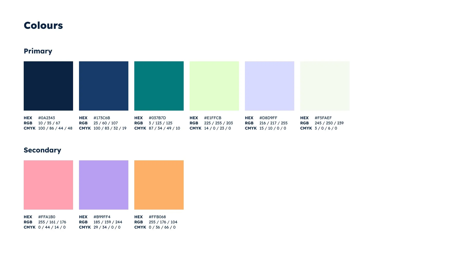
This, combined with the discovery information and tone of voice helped to inform the colour palette and strategic approach to the brand, and how we would start to bring in graphic elements to get the feel of the brand across.
It was really important to make sure this was well suited to a neurodivergent audience and needed to be the perfect balance of professional and inclusive yet also fresh, bold and modern.
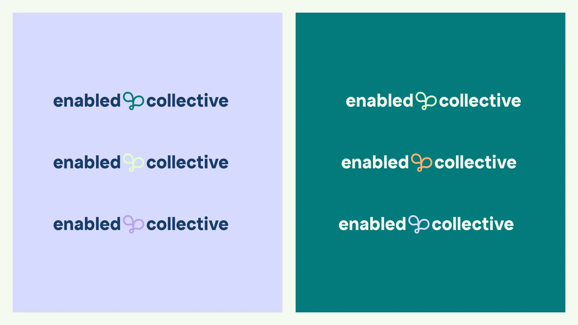
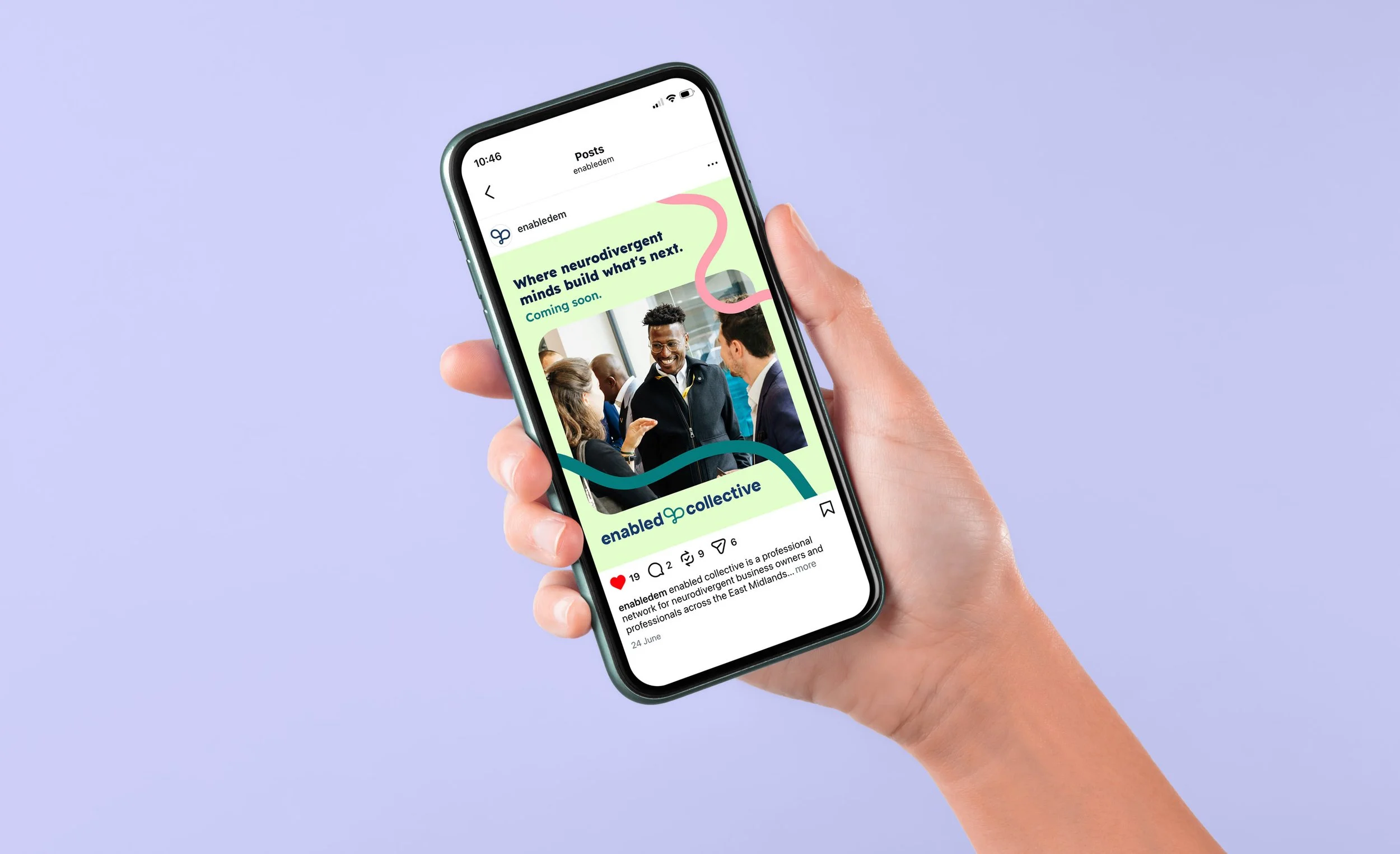
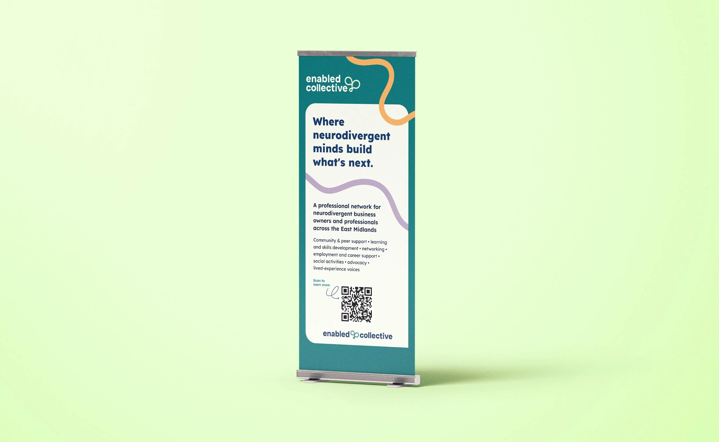
This was done through clear, professional and accessible typography (which is also dyslexia friendly), a logo that combines both professionalism and playfulness, accessible yet bold colour combinations to appeal to the audience, and graphic elements that add a fresh feel.
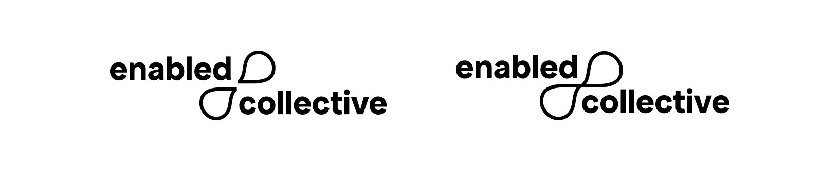
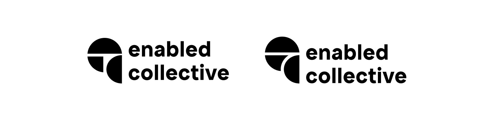
With the logo, the priority was legibility and professionalism with a bit of creativity. I chose to keep the wordmark clear and simple, and then introduce the logo concept through a conceptual logomark. The logo concept combines the main themes of the brand - conversation, connection, community, neurodiversity and growth, learning & support.
This was then all pulled together into a cohesive brand identity document to help the brand stay consistent and relatable to the audience across all touchpoints.
The next phase was to start expanding the brand out further into different assets and touchpoints, and this also included the introduction of graphic elements, which are there to again represent the main themes of the brand - community, connection, networking, and neurodiversity.
The final result was a cohesive, inclusive and creative brand identity that we can build on over time and ensure a strong and consistent brand across all touchpoints to help the network to grow.
This is an ongoing project and will grow and expand over time as the network starts to grow, and will also include a website, further social media and other assets.

Let’s work together
If you're looking for a designer who brings creativity, strategy and understanding to the process, someone who really listens and works with you to create impactful and human-centered design.. I’d love to support you! Whether you’re starting from scratch or ready to refresh what you’ve got, let’s collaborate on a brand or website that helps move your business forward.