
PAPYRUS
WEBSITE UI DESIGN
Designing an future-proofed and impactful website for young person’s suicide prevention charity, PAPYRUS.
PAPYRUS are a charity working to prevent young suicide in many different ways. From providing support to young people in crisis, to providing training and raising awareness through campaigns, conversations and shaping policies.
Supporting agency Kind on this project, my role was as UI designer.
The previous website was really difficult to navigate with important information being buried and hard to find. It didn’t look like it was aimed at young people and didn’t have a lot of clarity around who the website is for and what support they offered.
The new website needed most importantly to have clear and easily accessible crisis information for young people at risk to find out what help is available and immediately get the support they need. This was absolutely crucial when it came to the design of this website with the crisis information and the way help is signposted needing to be as clear as possible. It also needed to provide guidance and support to concerned people as well as represent the deep level of work that PAPYRUS does.
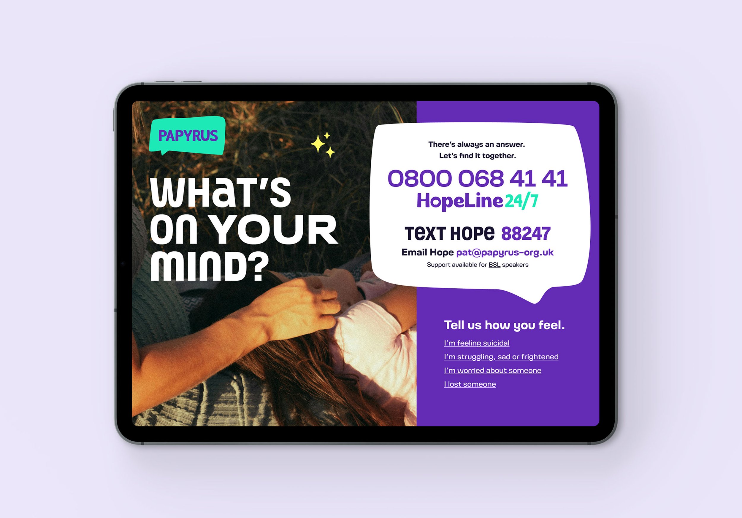
Kind initially took this project on as a new website project, but Papyrus needed much more than just a new website. Papyrus needed a full brand transformation in order to clearly communicate the crucial work they’re doing and support the people that need it.
Kind went through an extensive, in depth and detailed discovery phase for the project to allow them to create a brand strategy and brand identity for Papyrus which would go on to inform the website strategy and user experience.
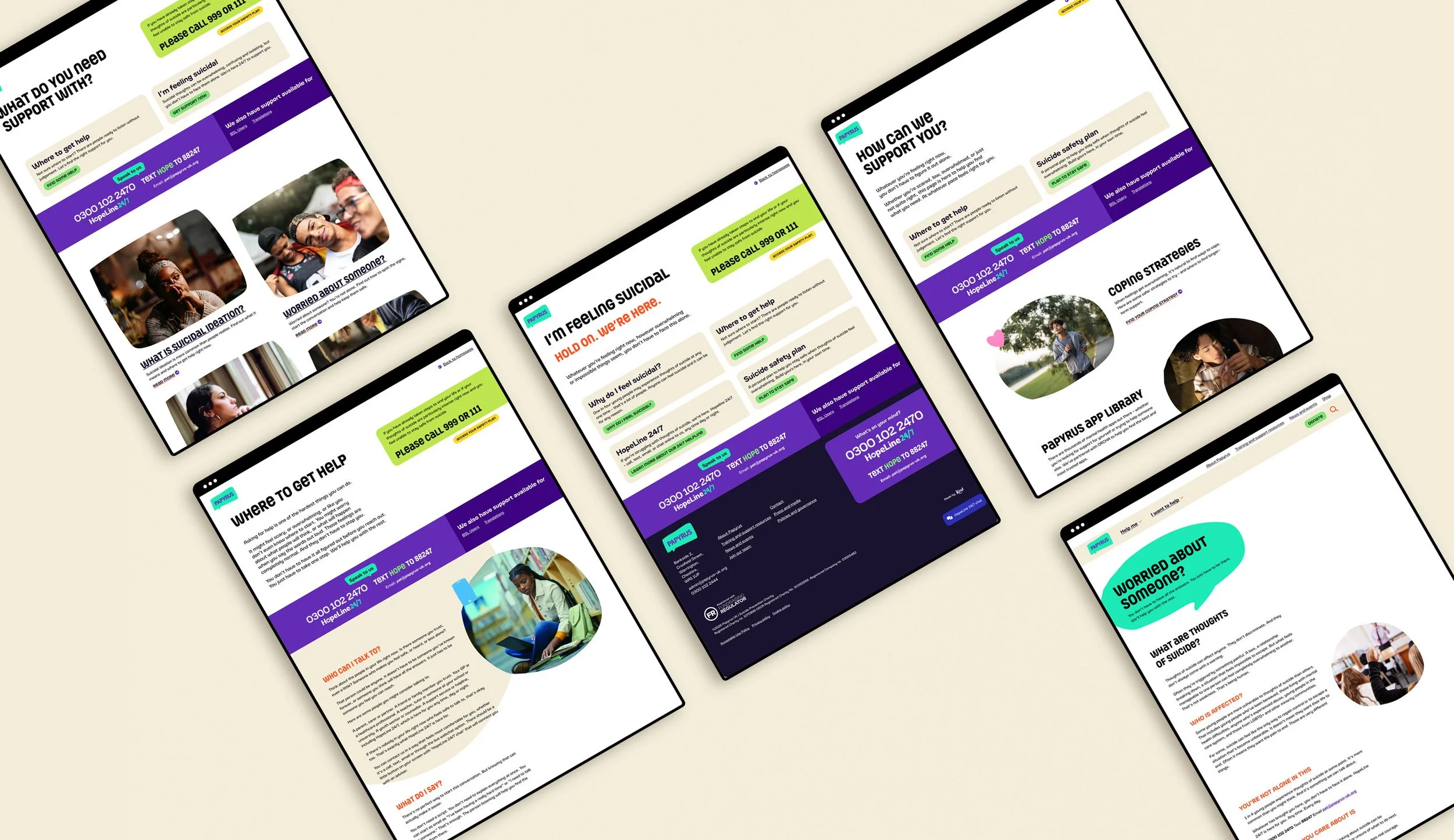
I was briefed into the project for the website design phase, where I was given access to the research and discovery phase outputs including the user needs workshop. Kind had also worked on the Information Architecture and wireframes for the project beforehand as it was so important to get this right to ensure people in crisis could get the information they need immediately, with other user groups being able to also find the information they need.
Kind talked me through the brand strategy and identity, followed by the wireframes and UX decisions made so far, at which point I took responsibility for the design phase of the project.
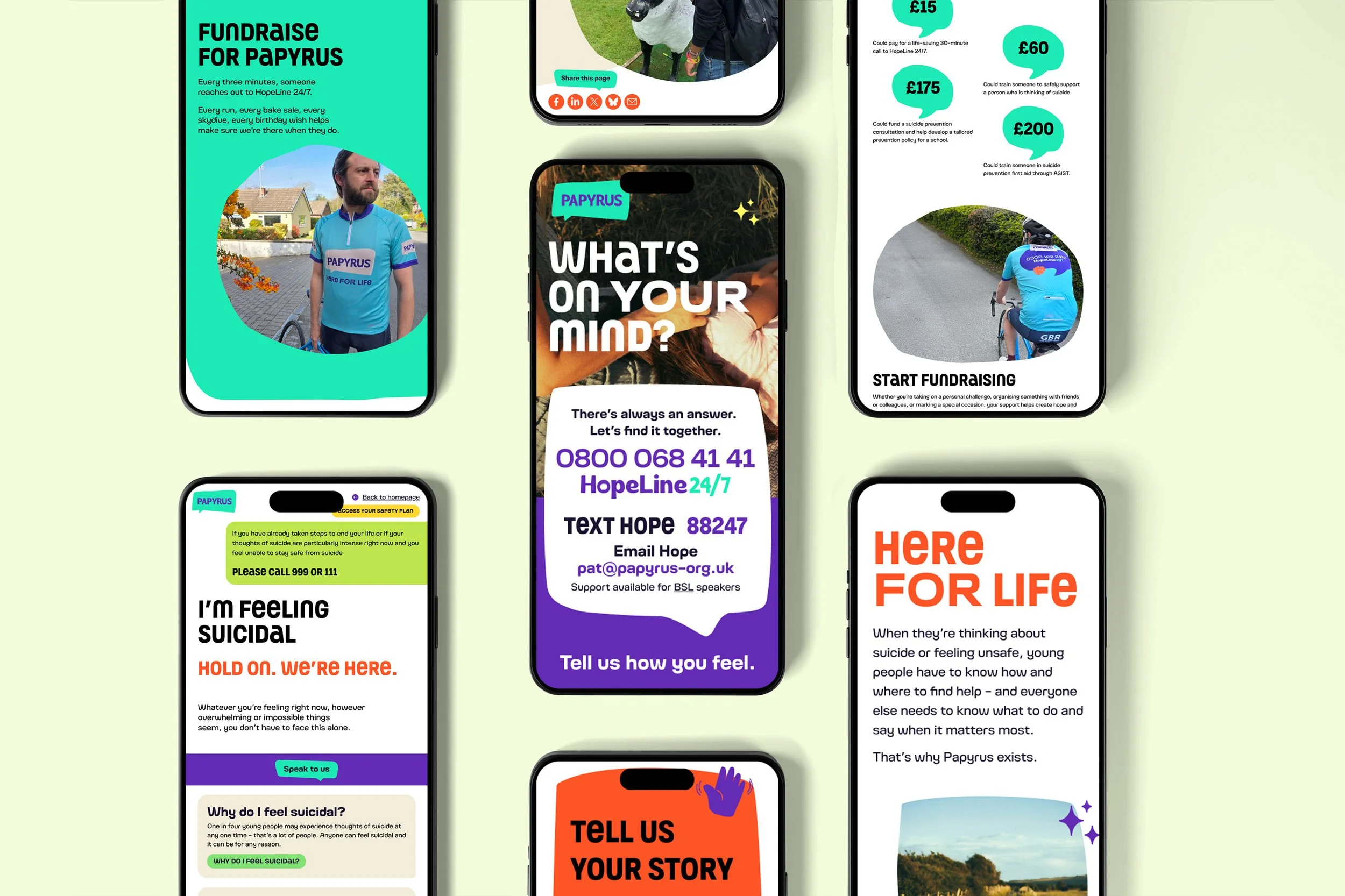
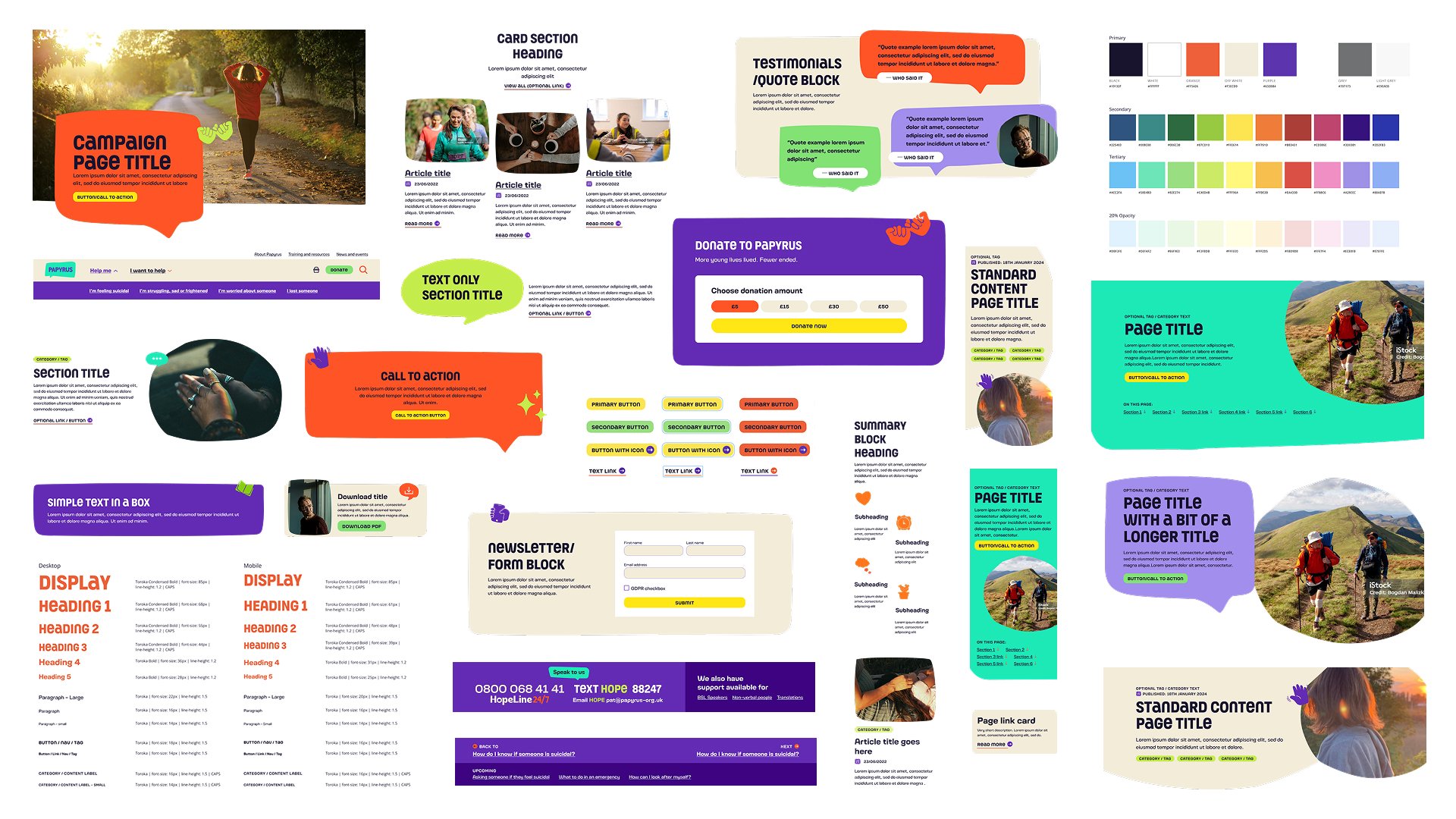
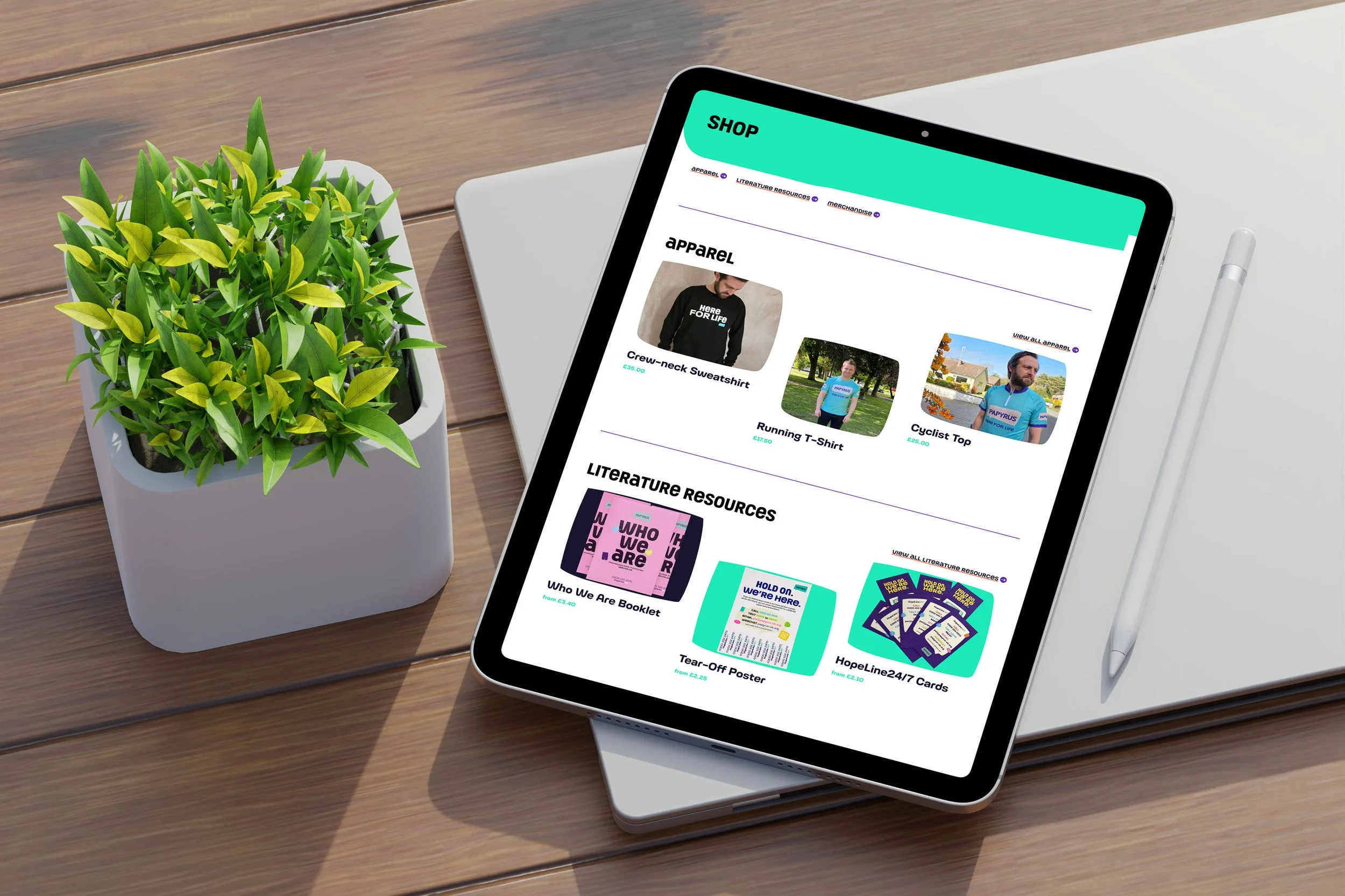
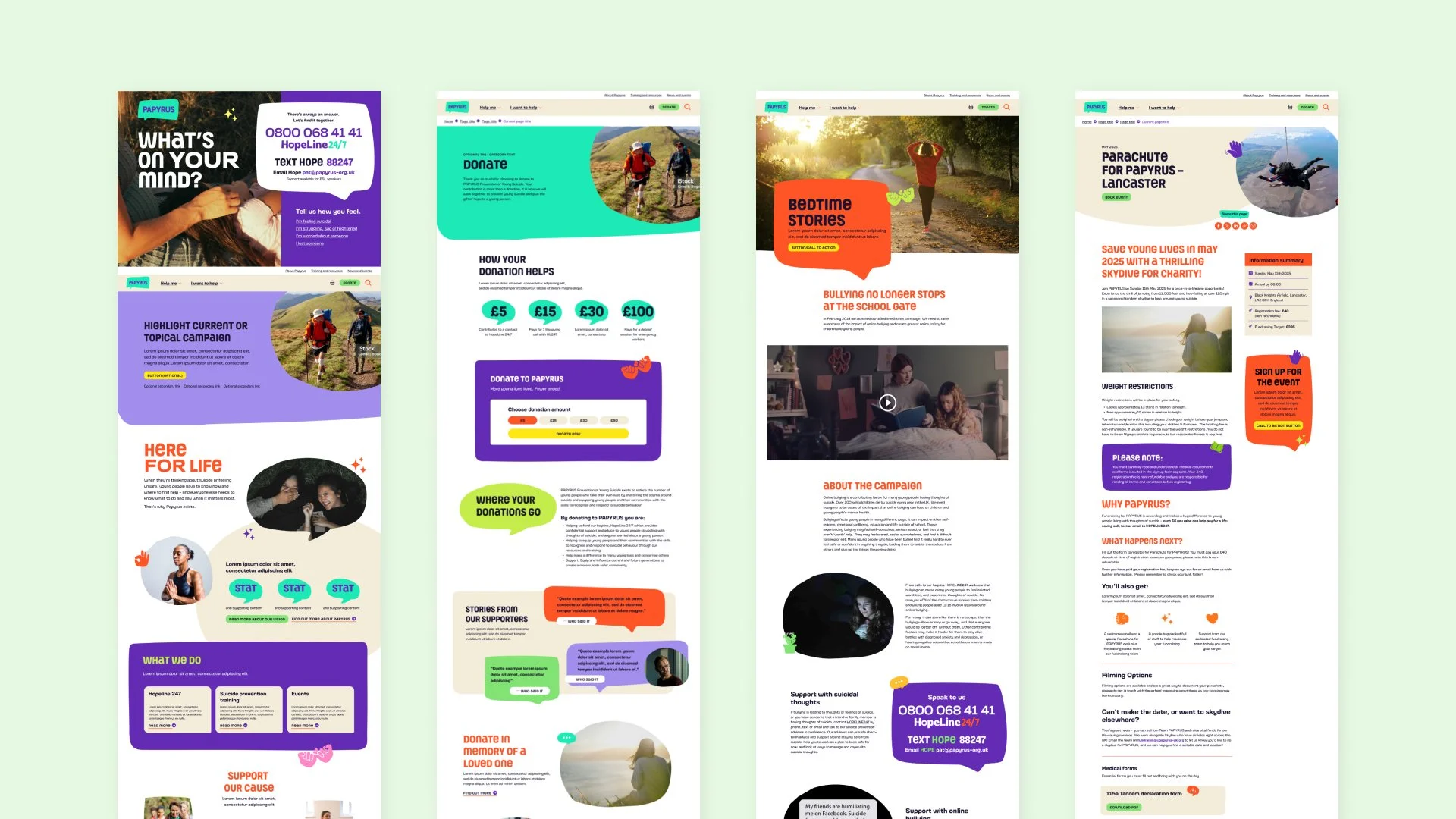
I built out the digital style guide in Figma using the detailed brand guidelines and created a design system based on user needs, research and discovery. I started with the homepage and crisis pages, ensuring that important crisis information was accessible and immediately available in order to reduce friction for anyone needing immediate support. I then went on to build out a comprehensive component library and UI templates to allow Papyrus flexibility over the rest of the pages so they could provide the support, guidance and training for the rest of their users and represent the important work done by PAPYRUS in the best way possible.
The final result is a user-friendly, easy to navigate website where each user can find the information and support they need, especially young people at risk, informed by in-depth brand strategy, discovery and user research to ensure a future-proofed and efficient website.
Let’s work together
If you're looking for a designer who brings creativity, strategy and understanding to the process, someone who really listens and works with you.. I’d love to support you! Whether you’re starting from scratch or ready to refresh what you’ve got, let’s collaborate on a website that helps move your business forward.