The Vintage Tipple Bar
BRAND CREATION
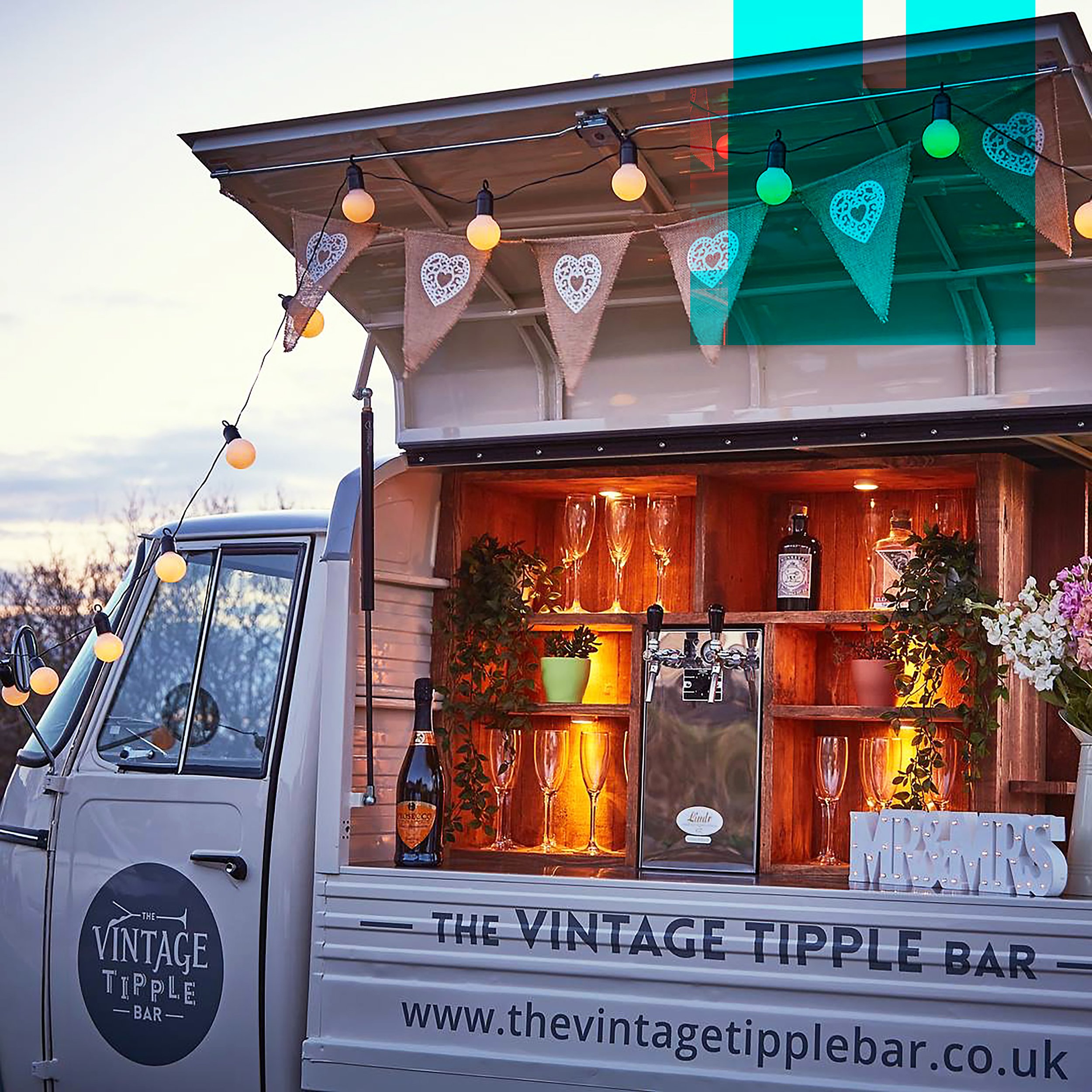
Logo design and van layout design for a startup mobile bar for hire. The Vintage Tipple Bar is a converted vintage style mobile bar offering a bespoke drinks service and party bar hire for events, weddings and various occasions.


The Vintage Tipple Bar came to me for help in designing a unique, hand designed logo for their new company about to launch, using an old tuk-tuk style van converted into a vintage style mobile bar and transported all the way from Italy to the UK.
The logo would be used on the van and social media, so needed to be the perfect representation of the company and show who they were through the styling of the logo. The target audience is sociable, young and potentially professional women aged 25-35, who are likely to use social media to post images of the stylish and on-trend bar. This means the logo needed to be clear, simple and show who the company are. The brand tone of voice is a mixture of classy and vintage, combined with fun and quirky.
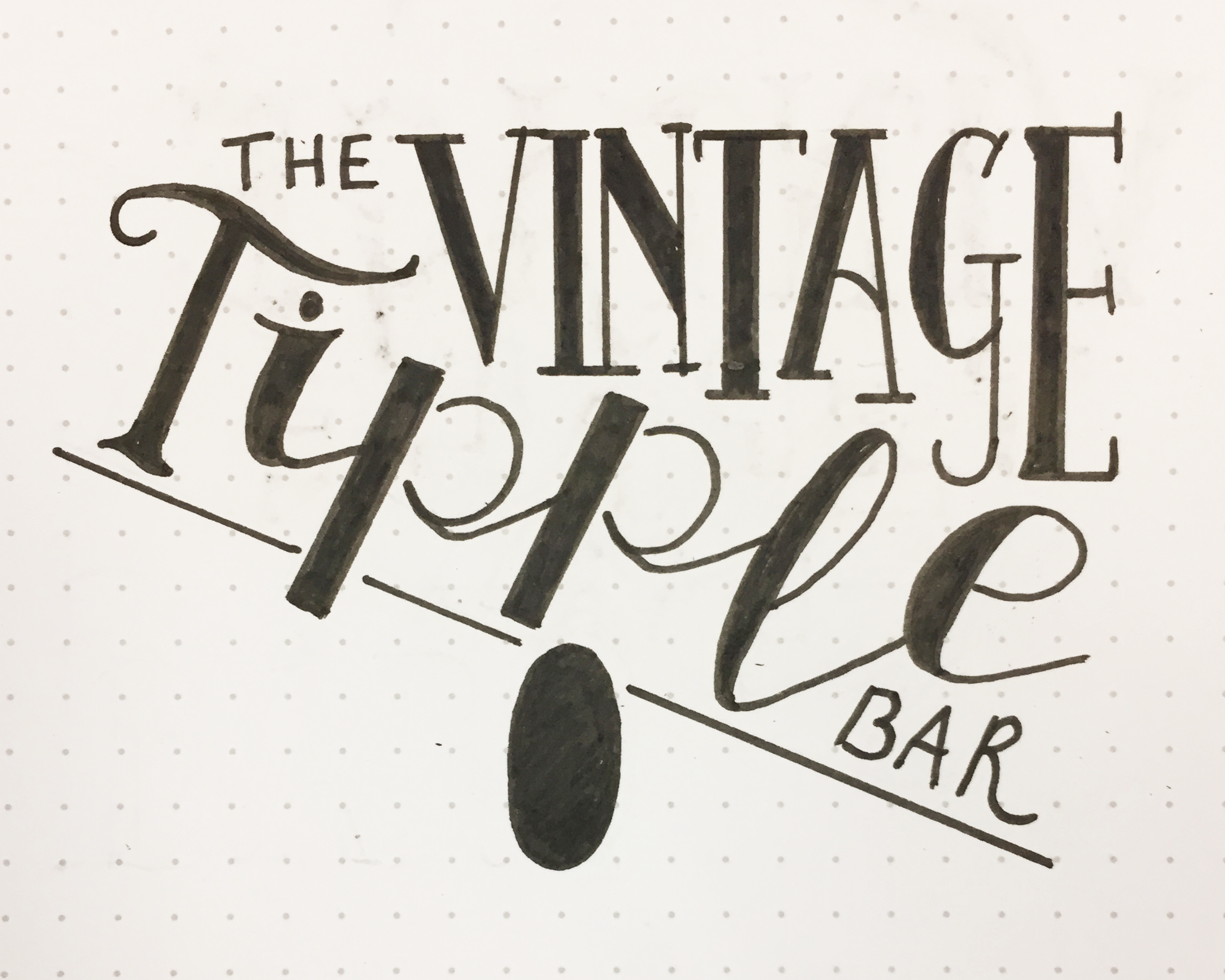
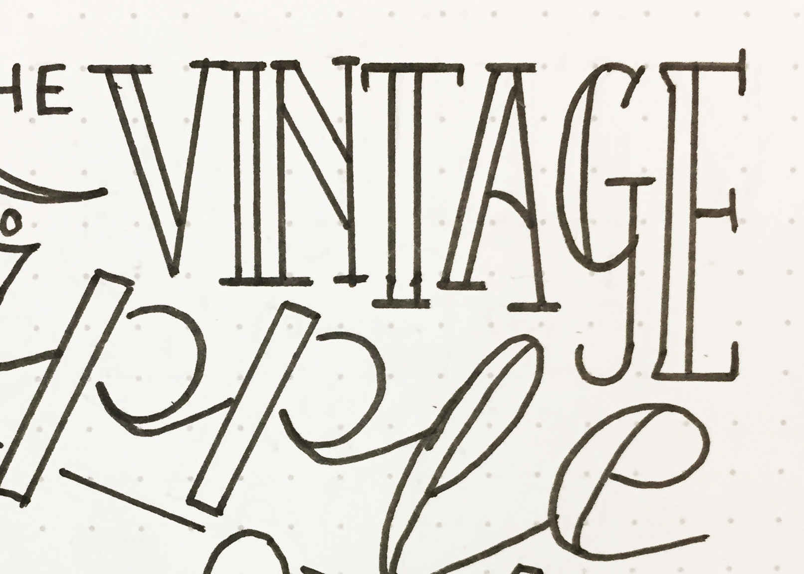
The challenge was creating an individual logo for a saturated market. I wanted to create something hand lettered to give it some individuality and to also reflect the tone of voice of the company.
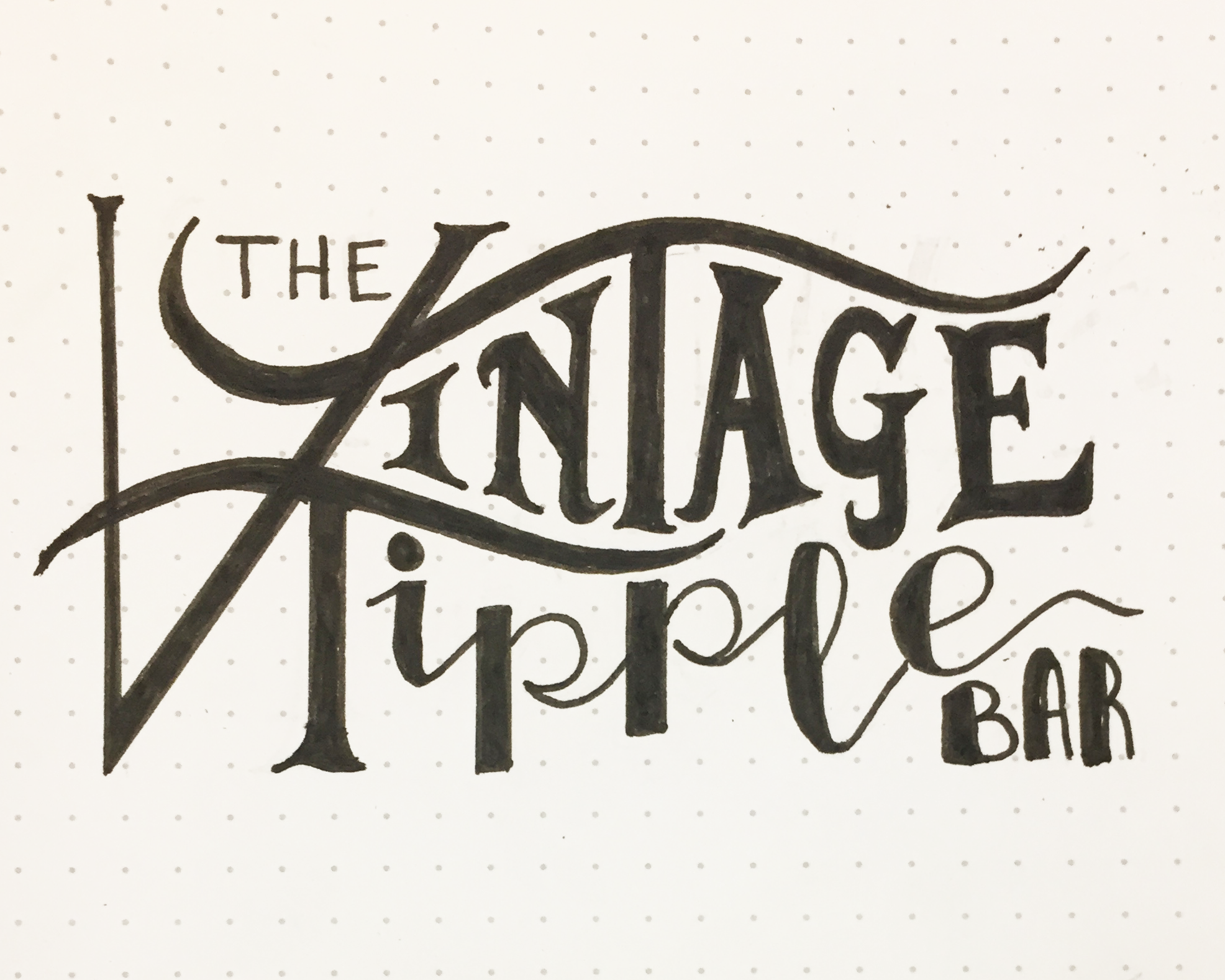
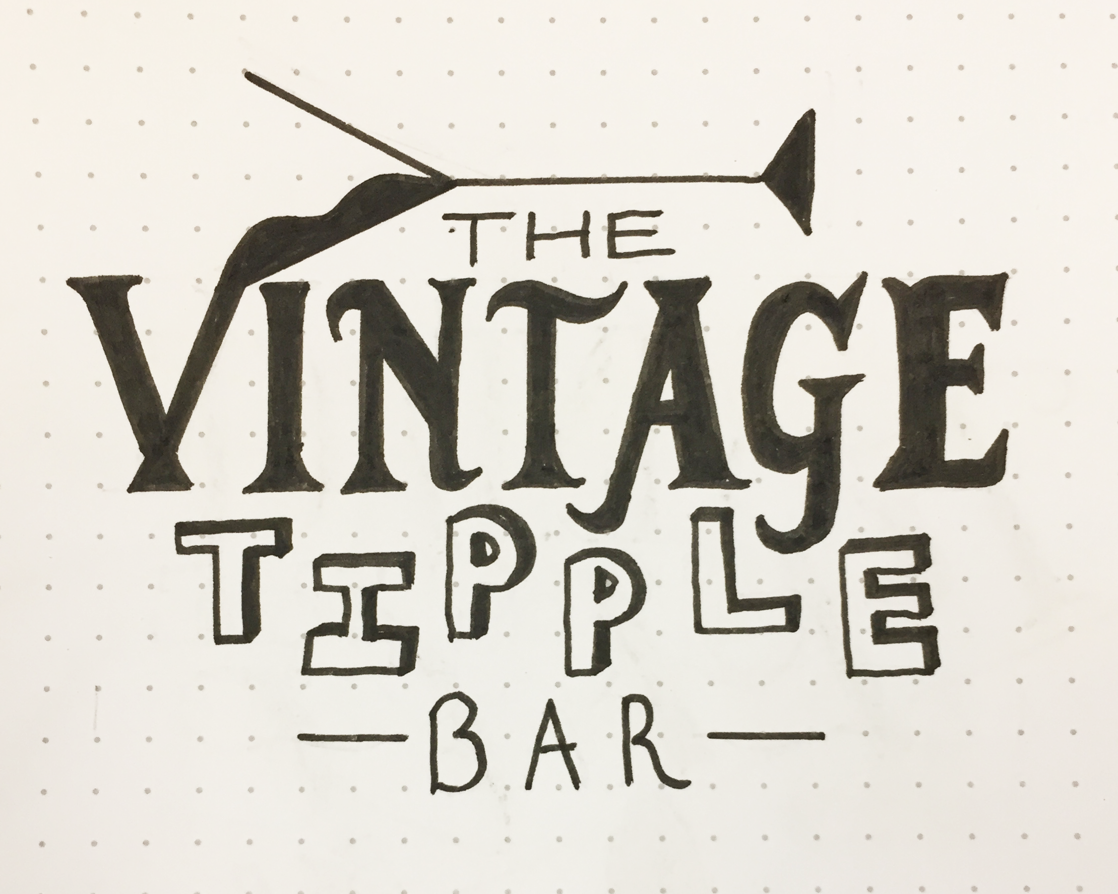
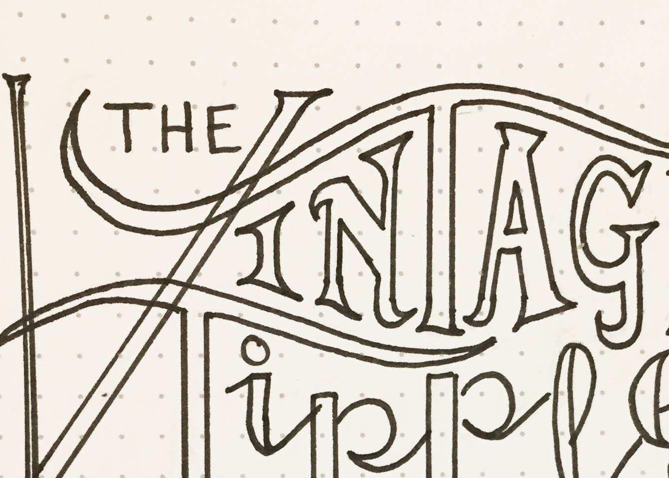
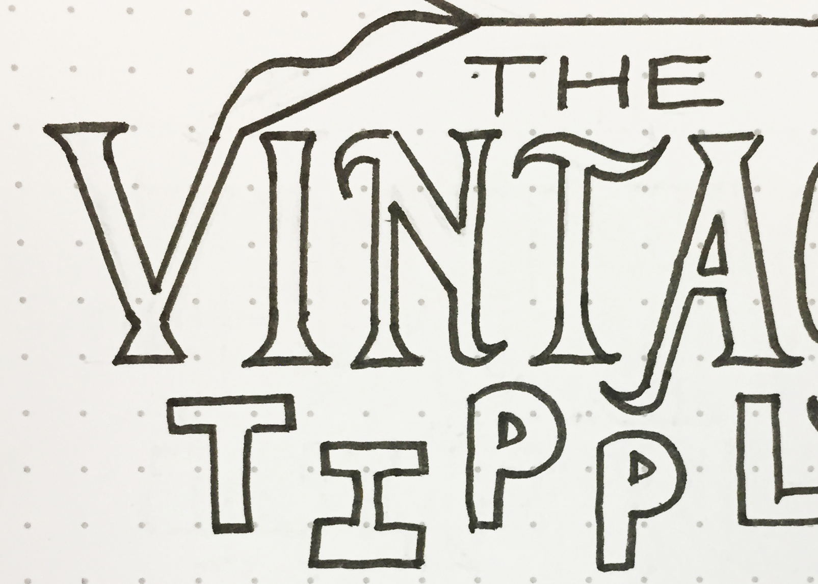
I started by getting all of my immediate ideas onto paper and creating some really rough concept sketches. I looked at the words both individually and on their own. Spending time at the start of a project doing this is really useful as it helps you to push through the initial boundaries and obvious ideas and to start to refine a few ideas quickly, and early on in the project. From this point I selected the 3 best concepts for the logotype and, still by hand, developed these into a clearer set of designs ready to present to the client. The next step was for the client to choose one of these concepts, of which I developed digitally into a refined logo design by working together with the client to come to the logo solution we were both happy with and one that represented the company well. The chosen concept was number ? And it is a fun play on the word ‘tipple’ with a touch of classy, vintage lettering styling added in.
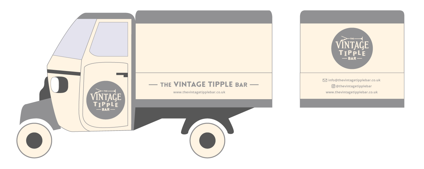
Following this, I went through a process of choosing the brand colours based on the tone of voice. The colour theme would be warm but muted colours, to add to the classy feel. I selected various colour palettes, narrowed this down to several palettes based on what worked best with the logo and also what would translate the best across the brand. These were then presented to the client showing how the colours could apply to the logo in different ways. The circle was also added in at this later stage when considering the contexts in which the logo would appear, and also to simplify the colour system.
The final logo design decided and colours selected, the logo could then be sent to the client to be used. The first step was the van, where I created a layout design for where everything would go so the client could then brand the van ready to start using.
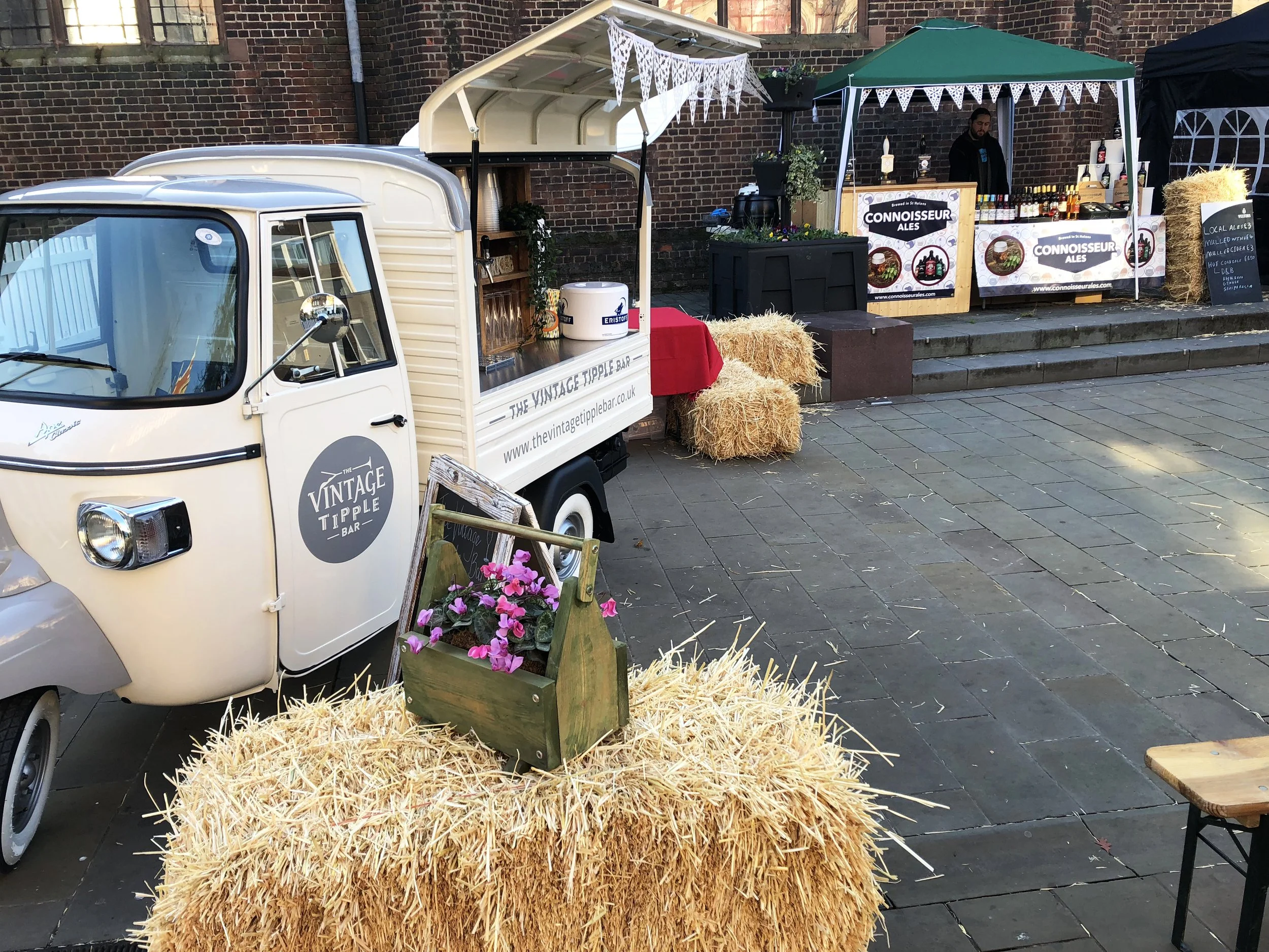
Since it launched in 2017, The Vintage Tipple bar has been extremely successful, attending events and being hired out for many private events.
Let’s work together
If you're looking for a bespoke lettered logo design or help with creating a strategic, creative brand that tells your story and what you offer, please get in touch for a chat today to find out how we can work together.